


Swift Discovery ➡ Indie App Devs
Weekly tips for indie app developers.
Big changes! 🚨
“Swift Discovery” newsletter is changing the name to “Indie App Devs” and coming with a new format!
Each week we will share in-depth content from professionals on various topics how to build, maintain and make money as indie app developer.
We start with Teodora owner of Designerants. She creates screenshots that convert to downloads and revenue in the App Store. Follow her on X & LinkedIn.
5 screenshot hacks devs can use to make people stop scrolling
Let's talk about one of the real headaches of app development: the design of App Store screenshots.
You're stuck wondering which tool to use, how to get more downloads, and why creating these screenshots feels like a pain in the ass.
In a sea of apps, screenshots are the first step of the funnel between your app and users. Crafting high-converting screenshots is the key to climbing the App Store ladder.
Apple will reward apps with higher conversions. If you have a set of images that stand out, you will win the ASO battle.
These techniques are like a checklist, if your image misses any of them, it will underperform.
If you add them to any image, the conversion rates will automatically increase since the techniques are designed to mitigate errors that images need to have in order to convert.
They work especially well since I designed them for non-artistic people. Anybody can follow them, and they will result in better conversion rates.
The techniques also have the following properties:
Make users stop scrolling the App Store and look at your app.
Are reusable across multiple apps niches.
Especially made so developers can replicate it over and over again on new apps.
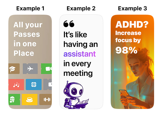
1. Add huge text
Have you ever been driving and after noticing a billboard, you couldn't remember what it was about because the text was too small?
Now imagine that billboard surrounded by hundreds of other billboards, all fighting for attention.
Well, that's the App Store, and your app listing is that singular billboard. In any context, font size should be as large as possible.
Someone scrolling through theApp Store is like someone driving on the highway very fast.
When people see a short text (less than ~7 words), they will read it, they will automatically do it, without thinking. That's how human brains work.
Then, depending on your copywriting skills, the message either hits or is forgotten. But you can have the best copywriting in your App Store screenshots, if it's totally unreadable, they won't be able to read it.
Users will scan your screenshots in less than 1 second, and if they need too much brain power to decrypt your texts, they will just pass.
The perfect recipe for text failure - Unreadable fonts, small text size and small text size plus bad text color contrast:
What you can do:
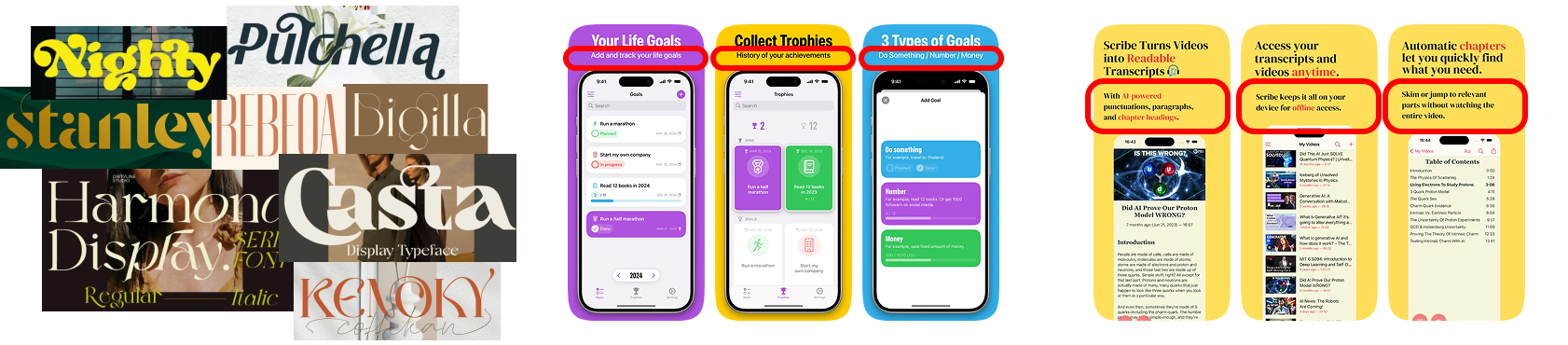
#1 Use a standard font style that is easy to read and recognizable for the users. For example the standard Apple font called "SF Pro". Do not try to reinvent the wheel here:
#2 If you think your text size is ok, is not big enough, always make it bigger! On a desktop screen every text looks amazing, but try to place it on your smartphone and check if you can read something while scrolling.
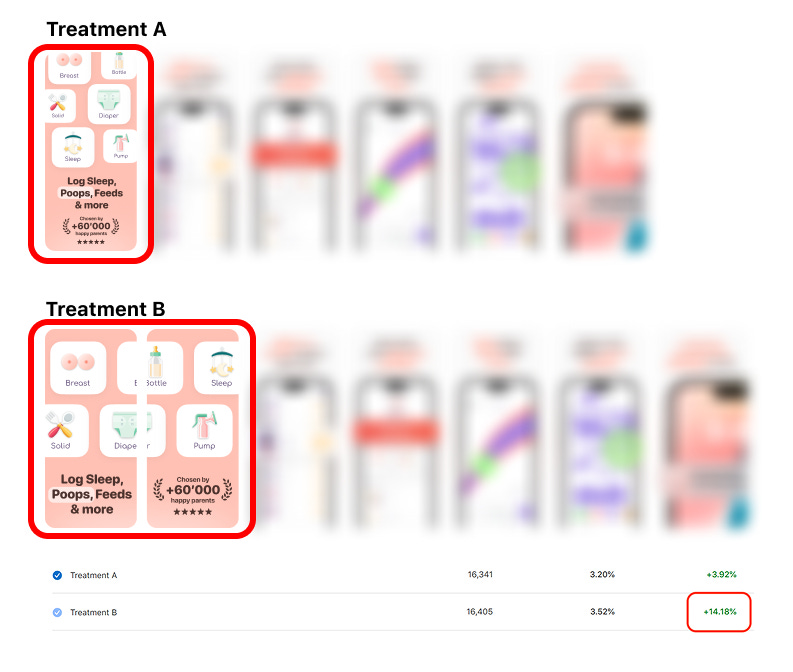
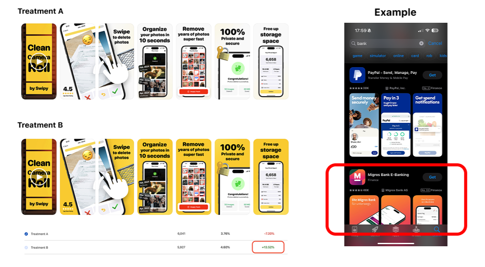
Look at this client A/B test below. The main text size was increased, even taking two screenshots to make people stop scrolling, look and read. Ended up with +14% increase in conversion rate:
#3 Text color contrast is extremely important. You can have a big font size, but if you can read it because the font is red and the background is pink, you are throwing your work away.
Great way to ALWAYS have a great color contrast, is by adding a stroke to your text. This way, doesn't matter what background color you have, your text will be always redeable. Here some examples:
2. Contrast color
The easiest way to make your screenshots stand out is by using a contrast background color. Let me explain.
You need to search inside theApp Store for your competitors, and look what are the main colors they are using for their screenshots.
For example, financeApp Store screenshots are more "blueish". So you should use a completely different color to stand out. You can use a complementary of blue, that is orange. Just ask an AI what are the complementary colors of the color of your competence you need to avoid.
Another approach is to have two set of screenshots with two different background colors and A/B test them. Usually one with a "boring" color like white or black, and another set with a "shiny" color that most of the times stand out, like yellow.
Extra tip! Take into account that screenshots with white background or black background will blend with the background UI color of the App Store itself, so you have less chances to stand out.
Look at this clientA/B test below. The background color change take minutes to do and ended up with +13% increase in conversion rate:
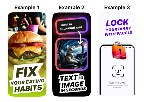
3. Artifacts
"Artifacts" inside App Store screenshots are any element that will make the user stop scrolling and look at one point.
This artifacts need to stand out from the other elements inside the screenshots, that's why we use eccentric colors.
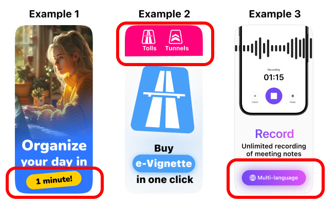
It's important to use just one artifact inside one screenshot, if you use more, then won't stand out and the user will not focus at just one point.
You have to think of this as an added element that doesn't fit at all with the rest of the content, which is why it stands out.
A good way to detect if you've added an artifact that stands out is by showing your screenshots to someone else and asking where their eyes are drawn first. If the answer is the artifact, then you've done it correctly. Here are some examples:
4. Weird images
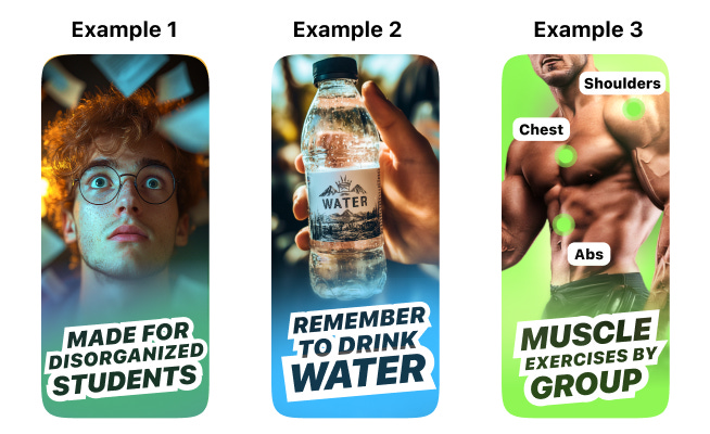
I often use are YouTube thumbnails as a source of inspiration. Crafting eye-catching screenshots is similar to designing YouTube thumbnails.
Our human mind will release dopamine when we feed our curiosity. This is why weird, unnatural elements will trigger our inner processes.
You have just one second to grab someone's attention. If you fail to do so, your app will be ignored.
You probably click on on YouTube thumbnails that have some kind of "rare" image because your brain thought "what's that?". That's the same reaction you want to cause in people who are scrolling through theApp Store and see your screenshots. Examples of stunning images:
Bonus: the uncanny valley
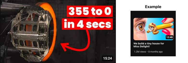
You can also use the uncanny valley effect.
Humans are programmed to avoid parasites that try to mimic real things. We have an inner system to detect fraud and trigger alarms.
This alarm will trigger more easily with any human image but it can be also triggered with common objects we are familiar with.
It can also be triggered with objects our mind cannot catalog easily.
You can use the uncanny valley (especially usingAI) to break people from their doom-scrolling activity. Example of hard to catalog mechanical item and unknown item:
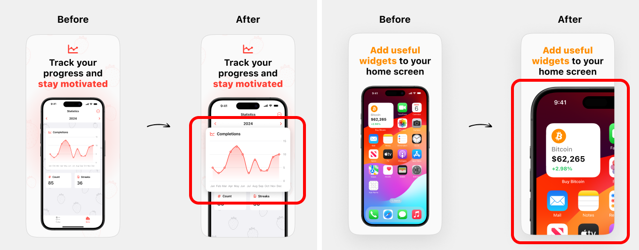
5. Zoom-in
Do not be afraid to zoom in key elements of your app UI. People's eyes are drawn to large elements, and the bigger, the better.
They don't want to think to understand what they're seeing. They just want to see it. By making elements larger, you also stand out among your competitors.
Here are some examples, you can zoom-in the entire screen, or just one part of the UI:
Want to learn more?
Teodora shares all her App Growth secrets 👉 App Growth Academy.
Don’t forget to check Designerants where she creates screenshots that convert to downloads and revenue in the App Store. And follow her on X & LinkedIn.